Data Analytics for Crisis Prediction Use Case Diagram
Introduction
Table of Contents
Imagine you’re planning a new IT project. You know what you want to build, but explaining it to others? That’s the hard part. This is where use case diagrams come in. They turn complex ideas into simple visual stories—perfect for IT students, developers, and project stakeholders.
Use case diagrams are powerful tools in system design. They show how users (called actors) interact with a system and what features the system offers. Instead of reading long technical documents, you see who does what in a single glance. Whether it’s an admin managing users or a data analyst predicting a crisis, use case diagrams make it clear.
For IT students, these diagrams are a game changer. You don’t just list features—you map out user interactions. This helps you understand the project scope and spot missing requirements early. Developers benefit too. With clear visuals, the entire team stays aligned, reducing misunderstandings and saving time.
In this blog post, I’ll show you how to create use case diagrams for IT projects like a Data Analytics for Crisis Prediction System. This kind of system is used to forecast crises—like natural disasters or economic downturns—based on data patterns. We’ll explore how users interact with the system, from uploading data to generating reports. You’ll learn how to turn ideas into visual diagrams that help you communicate better and build smarter.
Here’s what to expect:
- A beginner-friendly explanation of use case diagrams and their key components
- A detailed example for a Data Analytics for Crisis Prediction system
- A ready-to-use PlantUML script
- Best practices and common mistakes to avoid
Let’s get started on visualizing your IT project!
Understanding Use Case Diagrams
Use case diagrams are visual tools that show how users interact with a system. Think of them as blueprints for your IT project. They help you see the big picture without getting lost in technical details.
Key Components:
- Actors: These are users or external systems. They interact with your system. For example, in a crisis prediction system, a “Data Analyst” or “Emergency Officer” could be actors.
- Use Cases: These are the actions or tasks users perform. Each use case represents a system function—like “Upload Data” or “Generate Forecast Report.”
- System Boundary: This defines what’s part of the system. Everything inside the box is your system’s responsibility; everything outside interacts with it.
UML Basics:
- Ovals represent use cases.
- Stick figures represent actors.
- Lines show how actors connect to use cases.
When to Use Them:
- During the planning stage of IT project development
- When you need to define what your system will do
- To improve communication between team members and stakeholders
Why Use Them:
- Clarify project requirements
- Identify user needs and system limitations
- Prevent feature creep and miscommunication
Let’s say you’re working on a system to predict natural disasters. Your actors could be “Meteorologist” and “System Admin.” The use cases could be “Input Climate Data,” “Analyze Patterns,” and “Trigger Alerts.” This makes it easier to explain your project to a client, classmate, or team leader.
Use case diagrams simplify the process of IT project visualization. You can break down complicated systems into understandable chunks. Whether you’re building a payroll system or a data analytics platform, these diagrams keep you focused and organized.
Use Case Diagram: Data Analytics for Crisis Prediction System Example
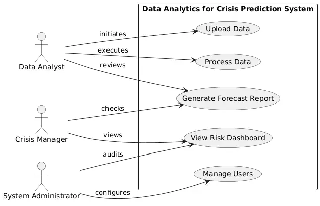
The Data Analytics for Crisis Prediction System helps organizations monitor, analyze, and forecast potential crises. These crises can range from environmental disasters to financial or public health emergencies. The system collects data, analyzes it using algorithms, and presents predictions in a user-friendly way.
Key Actors:
- Data Analyst: Uploads and processes data.
- Crisis Manager: Views analysis and takes action.
- System Admin: Manages user roles and system settings.
Primary Use Cases:
- Upload Data
- Process Data
- Generate Forecast Report
- View Risk Dashboard
- Manage Users
System Boundary Description:
All system features are inside the “Data Analytics for Crisis Prediction System” rectangle. Actors interact with use cases through defined lines:
- The Data Analyst uploads and processes data.
- The Crisis Manager views reports and dashboards.
- The Admin manages users.
This diagram ensures clarity. It shows how each actor fits into the system. For example, the Data Analyst has no access to user management, while the Admin doesn’t process data. This separation helps improve security and role clarity.
Real-world Application:
In a government disaster response unit, a use case diagram helps team leads understand how data flows. Who is responsible for uploading satellite data? Who reviews the prediction output? A visual use case model makes these roles clear.
This kind of IT project visualization improves collaboration, helps define requirements, and avoids confusion during development. Use case diagrams aren’t just drawings—they’re roadmaps to better project outcomes.
PlantUML Script for Data Analytics for Crisis Prediction Use Case Diagram
@startuml
left to right direction

actor "Data Analyst" as Analyst
actor "Crisis Manager" as Manager
actor "System Administrator" as Admin

rectangle "Data Analytics for Crisis Prediction System" {
(Upload Data) as Upload
(Process Data) as Process
(Generate Forecast Report) as Report
(View Risk Dashboard) as Dashboard
(Manage Users) as Manage
}

Analyst --> Upload : initiates
Analyst --> Process : executes
Analyst --> Report : reviews

Manager --> Dashboard : views
Manager --> Report : checks

Admin --> Manage : configures
Admin --> Dashboard : audits
@enduml
Explanation:
This PlantUML script models the core interactions within a crisis prediction system. It features three main actors:
- Data Analyst: Handles data-related tasks
- Crisis Manager: Uses the output for decision-making
- System Administrator: Oversees system operations
Each use case represents a key function—like uploading data or viewing risk dashboards. The layout flows left to right to keep connections clean and easy to follow. Lines do not overlap, ensuring the diagram stays readable.
Use this script in any PlantUML-compatible tool to visualize your system’s use cases. It’s an ideal starting point for IT students and developers working on predictive analytics projects.
Best Practices for Creating Use Case Diagrams
Creating use case diagrams doesn’t have to be hard. Follow these best practices to keep them clear and useful:
Keep It Simple:
- Use short, action-based names for use cases (e.g., “Upload Data,” not “The User Uploads Their Data”)
- Limit each diagram to one major system to avoid clutter
Focus on User Goals:
- Think like a user: What tasks do they need to accomplish?
- Group similar tasks together
Validate With Stakeholders:
- Review your diagram with users and team members
- Adjust based on feedback to cover all important interactions
Avoid These Mistakes:
- Don’t overcrowd the diagram—use multiple diagrams for large systems
- Don’t forget to label relationships clearly
- Don’t skip essential actors (even if they seem obvious)
Use Reliable Tools:
- Lucidchart: Drag-and-drop interface, great for teams
- Draw.io: Free and integrates with Google Drive
- PlantUML: Code-based, perfect for developers who want version control
Tips for Better Diagrams:
- Always define the system boundary
- Use consistent naming conventions
- Align actors and use cases cleanly to avoid intersecting lines
Use case diagrams are powerful tools for IT project planning. They improve communication, clarify requirements, and support better design decisions. By following these best practices, you’ll build diagrams that are useful, accurate, and easy to share with your team.
Conclusion
Use case diagrams are essential tools in any IT project. They simplify complex systems and bring clarity to project planning. Whether you’re building a payroll application or a crisis prediction platform, these diagrams help you understand how users interact with your system.
For the Data Analytics for Crisis Prediction System, the use case diagram breaks down tasks like uploading data, generating reports, and managing users. This visualization helps developers and stakeholders stay on the same page.
As an IT student or developer, using use case diagrams will make your projects stronger. You’ll define clear requirements, reduce confusion, and improve your system’s design. These diagrams are especially helpful for presentations, documentation, and team collaboration.
If you’re new to this, try tools like Draw.io or PlantUML. Start simple. Focus on your actors and their goals. Don’t worry about perfection—just get your ideas on screen.
Have another system you want diagrammed? Let me know in the comments! I’d love to explore use cases for other projects too. You can also share your diagrams or ask for customization tips.
Use case diagrams are more than just visuals—they’re project success tools. Start using them today to plan smarter, communicate better, and build with confidence.
You may visit our Facebook page for more information, inquiries, and comments. Please subscribe also to our YouTube Channel to receive free capstone projects resources and computer programming tutorials.
Hire our team to do the project.